Showing posts with label Papertrey Ink. Show all posts

Thursday, December 5, 2013

December Daily 2013

Hola peeps! I have a surprise for you all today – a video! I am going to warn you all that it is a bit long. And, because of my health issues, my voice is definitely higher than it used to be.

This is kind of serving as the introduction to what will be a little series that will run until I am finished. As of right now, it will spill over into 2014. I am okay with that. I know that I can only do so much and I don’t want to stress out. My plan is for the videos to be posted on Sunday’s.

Like I mention in the video, I am not generally a scrapbooker, so this is going to be a learning experience for me. I have a general idea, but for the most part I am going to go with what feels like me.

I mentioned in the video that I will primarily be using my iPhone and, when it comes, my new Rebel T3i to photograph the pictures for my album. To expound upon that, I will say that my everyday photos will be with my iPhone or maybe my little Kodak point-and-shoot. I am saving my DSLR for family gatherings and maybe some of the things that I do with the kids in the family. Also, I will be providing an InLinkz list of many of the products I will be using, but here is another list of basic supplies I will be using in case you’re wondering:

Album: Simple Stories Sn@p 6”x 8” in Red. All of the inserts will be Sn@p as well. I am using a random assortment.

Photo Paper: HP Premium Photo Paper (Gloss & Matte)

Printer: HP Photosmart Premium (It’s older so I will link to a newer model.)

Cameras: iPhone 4; Canon Rebel T3i; Kodak Easyshare C1450.

Photo Editing Software: Picasa & Adobe Photoshop Elements 11.

Cardstock: Papertrey Ink.

Other Supplies (click on picture for more information):

That’s all I have for you today! If you don’t want to miss out on the videos to come, make sure you subscribe to my YouTube channel. I decided that integrate my blog with my personal channel.

Thank you for stopping by! Have a blessed day!

Monday, June 17, 2013

A Winner & Simply Amazing

Hello everyone! I have a new project to share at the start of this wonderful week! I would say that it’s a return to my style, with a little drama – by way of some navy. I haven’t been using dark colors very much as of late.

DSCF2233

DSCF2238

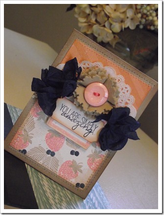
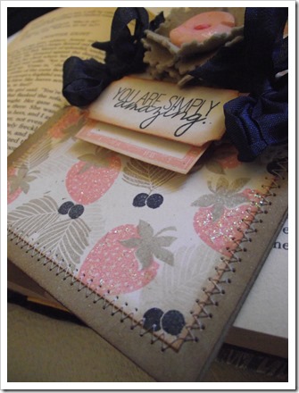
Sparkly strawberries! Why yes, I went there. I just couldn’t leave well enough alone, so I added some glitter, but I’m getting ahead of myself here! I used three sets from WPlus9 on my card today. I started with a panel of Rustic Cream cardstock and made my own patterned paper with the berries and leaves from Fresh Picked. Instead of doing the entire panel with the berries, I decided to add in a more subtle pattern to the top of the card. So, I used Country Charm to add some diagonal stripes to a small piece of Melon Berry cardstock.

I diecut a Label Number 5 and stamped it with the coordinating border image. When I sat down to make this card, I knew I wanted to use that label and I also knew I wanted to use that very sentiment. Now, the problem – if you’d like to think of it as such, was that the sentiment would not fit on the label without looking, to be frank, horrible. So,  I used an EK Success ticket punch because it fit my sentiment perfectly. From there, I adhered my floral embellishment and some navy seam binding bows on both sides.

Back to my glitter bombing. I did this with some stickles. I wanted hints of glitter, so I I just dabbed it here and there. And, finished the entire card off with a spritzing of Mister Huey in Calico Shine. Bam. And, I’m a happy boy!

Supplies

Stamps: Fresh Picked, Country Charm, Quite Like You: WPlus9.

Cardstock: Kraft, Rustic Cream, Melon Berry: Papertrey Ink.

Ink: Crumb Cake, Night of Navy, Cameo Coral: Stampin’ Up.

Dies: Circle Stackers & Label Number 5: WPlus9.

Other: Calico Shine Mr. Huey: Studio Calico, Button: Papertrey Ink, Seam Binding: Liz’s Paperloft Boutique, Crystal Stickles Glitter Glue: Ranger

WINNER, WINNER!!

Okay, I used Random.org to select a winner for the My Creative Time stamp set giveaway, and the lucky person is: Vivi J! Congratulations my dear, I will be emailing you shortly!

Thanks everyone for stopping by! I wish you all a blessed day!

Tuesday, June 11, 2013

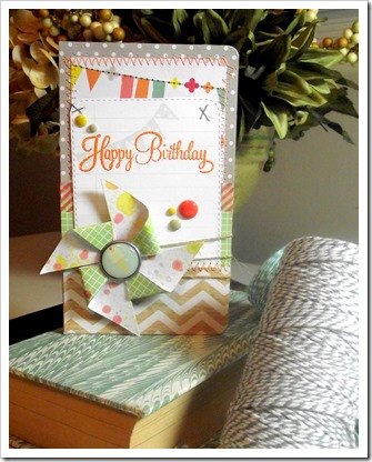
Pinwheel Birthday

Hello crafty peeps! I have a super special post for today. My former DT boss, Emma, invited me to guest design for her and I was more than happy to oblige!

We’re going to think of today as a bit of a Technique Tuesday. One of the most difficult things I can think of is mixing patterned papers. So, my card today will hopefully show you how you can mix different patterns cohesively.

I’m going to throw out a disclaimer, however. I am not a graphic designer so I can’t honestly say that I have special training that makes me an expert. I studied Interior Design,  so my pattern and color usage is influenced by that.

DSCF2295

DSCF2299

All of the papers  used are from the Dear Lizzy Neapolitan line. I bought it LAST year at Archivers and this is the first time I used it. My overall goal was to make a fun and bright card. Something a little outside of my comfort zone -  because my style is generally very shabby and vintage inspired.

The great thing about using a collection is that the color mixing is done for you. And, generally, the patterns will have a lot of built in coordination. I decided to choose four papers from the collection. I chose the wood grain chevron, green grid, and gray dotted papers because I wanted the banner pattern to provide the pop of color. None of them work against each other. They all kind of peacefully coexist because I used the right patterns in the right amounts.

Also, I left a lot of white space around the sentiment. Even though the pinwheel is a rather large embellishment. It doesn’t take the eye away from the sentiment. I think a lot of people would have used ink to splatter the sentiment card because the pinwheel had splatters. Doing so would have been a mistake because the pinwheel would have disappeared into a sea of ink splotches. Instead, I took some enamel dots and placed them around the sentiment to further define it and draw the eye in. And, in a way, you could imagine them as extensions of the ink spots flying from the pinwheel.

Supplies

Patterned Paper: Dear Lizzy Neapolitan by American Crafts.

Stamps: Journal It and Floral Sentiments from My Creative Time.

Cardstock: Stamper’s Select White.

Ink: Versamark. Mister Huey spray ink in Taxi, Water Cooler, and Boss Lady.

Embellishments: Rustic Twine from Papertrey Ink. Enamel dots and decorative brad from My Mind’s Eye.

Other: Corner Chomper by We R Memory Keepers. Apricot Zing embossing powder by American Crafts

Alrighty, before I let you hop away, I have a giveaway sponsored by Ms. Emma! I have a set from Emma’s last release that I just love! It’s called Life is Good, and I plan to use it in my Project Life album. All you need to do to win is leave me a comment here with a way for me to contact you. You’re not required to follow me or anything else. I will take comments up until 11:59 p.m. on Thursday, June 13th. Easy peasy!

1003880_10200678754204582_100338247_n

Thanks so much for stopping by today! I wish you all a very blessed day, and good luck!!

Wednesday, April 17, 2013

Life is Sweet

Hello everyone! I told myself I would do a better job of blogging, and it helps that I have had moments of inspiration hit me here and there. I have one to share today that I really love, and I take a lot of comfort in the sentiment. Especially so, given the events in Boston on Monday.

DSCF2234

DSCF2236

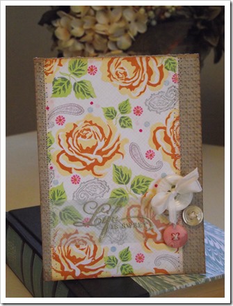
I used, The Sweet Life, a multi-step floral set from Papertrey Ink. It builds the most wonderful cabbage roses. Next to hydrangea, roses happen to be my favorite flowers. The more hues of ink in ones arsenal, the more possible combinations. Personally, I like to make mine look as realistic as possible. I mean, I doubt you’ll see neon roses here. I guess it could be fun if you’re into that kind of thing.

Because I can’t be satisfied with less, I went back in with some paisley stamps from a Recollections cling mount set that I just love. And, I filled in the pattern further with the strawberry flower from Strawberry Patch. The dots are from Polka Dot Basics I. I used my Envelope Pattern backgrounder to add a little texture.

I stamped my sentiment on a strip of vellum and heat embossed it with some detail gold embossing powder from Recollections. I used the envelope pattern on the back of the sentiment strip because I felt it needed a little bit of color, and because, I just can’t leave well enough alone.

The panel was sewn to a Kraft base embossed with my Squared Lattice folder. And, to finish it off, I added some buttons threaded with Rustic Cream twine, and silk ribbon.

Alrighty, that is it for me! I hope everyone has a wonderful week. Keep the people of Boston in your thoughts. I thank you all for visiting, and I wish you a very blessed day!

Tuesday, April 2, 2013

Shabby Cottage

Hey there! I hope everyone is doing well and had a wonderful Easter holiday. I am here with a little shabby number that I made for no reason at all, but to please my creative spirit. I think those that we make just for ourselves tend to be the best of them all.

Warning, this may be a bit photo heavy.

DSCF2261

DSCF2269

DSCF2262

DSCF2263

DSCF2266

DSCF2270

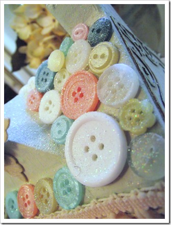
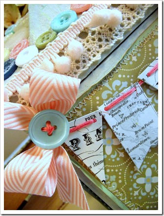
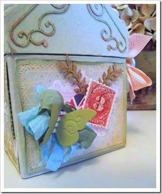
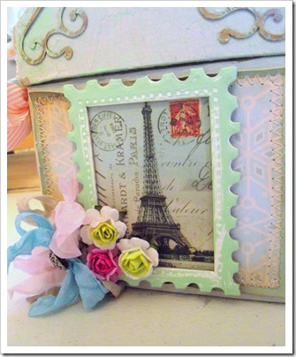
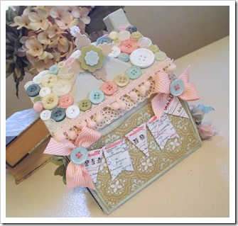
Everything about this just makes my heart happy. I know it looks like this took me forever, but it really did not. I think gluing the buttons on was the most time consuming part. It’s kind of a puzzle to fit them all in and make sure the colors flow. And, since glitter is my crafty crack, I felt it was more than necessary to give the button covered roof a generous coating.

Anyway, I am going to keep this short and sweet. Thanks so much for stopping by! Have a blessed day!
Tuesday, March 19, 2013

A Little Emerald Love

Hey all! I’m popping up with a number I made for this week’s Trigger Tuesday Challenge. In case you didn’t know, emerald is the color of 2013. Initially, I was hesitant to embrace it, but I really love it know. As many of you know, I work in retail and we have a lot of emerald pieces that I love. I would totally recommend picking up a few pieces because I find that it can be a very versatile and neutral color.

Elegant Emerald

I love the inspiration picture that Cath picked for the trigger. I especially love the ruffled top and the floral pattern of the dress. So, for my card, I tried to play that up.

DSCF2249

DSCF2243

DSCF2247

DSCF2246

I pulled out what is probably my favorite stamp set, Rosie Posie, and stamped a few blooms. I am sooooo happy that I didn’t get rid of my Jenni Bowlin Seed Packet ink pad. It’s the perfect shade of emerald. And, I also need to thank my dear friends Jess and Sara because if not for them, I would have never bought the huge package of glitter that just so happened to include . . . you guessed it, emerald. Woot, woot!

I made the crepe paper trim myself. I probably went a bit overboard, but I don’t care. For me, sometimes, more is more.

Alright peeps, that’s it for me today! You have about five more days if you want to join in on the fun! Thanks for stopping by and have a blessed day!
 

Sunday, March 3, 2013

Vintage Fabric Love

Yes, I know, I said I would make a better attempt to blog, but well - I work two jobs. My schedule can be kind of crazy. I work a mixture of days and, on occasion, overnight. A boy has got to eat and sleep sometime. However, I DO have three more projects to share soon (already photographed) because I HAVE been making things here and there. And, I have a list of things I want to make.

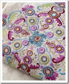
I’m here today with a card for the Moxie Fab Trigger Tuesday Challenge. It seems that I miss challenges a lot of the time, and I am so happy I found the time to participate in this one because the trigger is totally up my alley. A vintage embroidery pattern:

Pattern Play

I love everything about this, from the pattern itself, to the colors. So, I tried my best to make a project that reflected the original. I bought Lovely Layers from Papertrey a while ago (like, October!) and I hadn’t the chance to ink it up, but it was perfect for this.

DSCF2224

DSCF2228

DSCF2241

Lot’s of stamping here! I made this knowing that I was going to send it in the mail, so I wanted to keep it kind of, “simple.” The majority of the stamps from Lovely Layers. I went back in with an Inkadinkado flourish to add more detail. I also used some dots from Polka Dot Basics II, and a leaf from WPlus 9’s Folk Art Florals. To give it more of a fabric look, I took my Just Jeans background and stamped over the entire panel. I do this when I want to add more texture.

Thanks for stopping by! Have a blessed day.

Supplies

Stamps: Lovely Layers, Just Jeans, Folk Art Florals, Polka Dot Basics II

Ink: Regal Rose, Brocade Blue. Wisteria Wonder, Crumb Cake (SU); Limeade Ice, Scarlet Jewel (Papertrey Ink); Walnut Stain Distress Ink

Cardstock: Kraft, Rustic Cream (Papertrey Ink), Vellum (Jo-Ann)

Other: Tread (Coats & Clark), Button and Twine (Papertrey Ink)

Thursday, October 25, 2012

Papertrey Ink October Blog Hop

Hello. Yes, it’s been forever since I’ve posted, but I’m popping in before I head off to work! I wanted to join in on the festivities this month. Nichole selected some non-traditional color schemes and given that I am a bit out of the box with color, this was right up my alley.

Here is the scheme I selected:

PTI Blog Hop

And, from that, this is what I came up with:

DSCF2079

DSCF2085

This is one of the quickest cards I think I have ever made. Kept pretty true to what I like. I had he hardest time incorporating the Berry Sorbet. I love the color, but it’s much brighter than what I generally like to use, so I used it to compliment the Melon Berry.

Supplies Used:

Stamps: Background Basics: Sheet Music, Peaceful Pinecones & Think Big Favorites #20; Acanthus Background from Delta.

Cardstock: Spring Moss, Harvest Gold & Melon Berry.

Patterned Paper: Colorbok Victorian Parlour.

Ink: Stampin’ Up Certainly Celery, Calypso Coral & Groovy Guava; Versamark and Harvest Gold.

Dies: Peaceful Pinecones and Mat Stack 4; Woodgrain Impression Plate.

Other: Wilton Doily and Doodlebug Lily White Sugarcoating. 

That’s it for me! Thanks for stopping by. and I wish you a blessed day!
Thursday, October 11, 2012

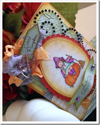
Autumn Greetings

Hello everyone! So, I’m starting a new adventure, and I am having a lot of fun with it. I have found myself being drawn to image stamps for a long time now, and I held off because I didn’t want another thing to spend money on. Well, that didn’t work, but I tried!

Disclaimer: I have never taken a class and I do not profess myself to be an expert, nor do I think you have to be. That being said, if the powers that be at Copic ever come across this, please schedule a class in the South! Like, Nashville or Birmingham please. Thank you.

DSCF0370

DSCF0372

DSCF0373

I think it is kind of hard to give a step-by-step description of the making of this card, so I’ll be doing it a little differently this time. I still kind of struggle with that.

I started with the cutest image from Stampin’ Up’s Greeting Card Kids stamp set. I have eyed this set since I started stamping, and I am so happy to finally have it. Because I am easing my way into coloring, I used a variety of markers for this project. I *think* that I will be buying the Copic Sketch markers. I am researching my options. I might stick with Prismacolors. Anyway, for this card, here are the markers I used:

Pumpkin

Prismacolor PM-15 Yellowed Orange, PM-16 Orange & PM-13 Poppy Red

Dress

Prismacolor PM-193 Mint Cream, Pm-166 True Green, PM-32 Parrot Green & Copic Sketch B000 Pale Porcelain Blue

Cape, Hat & Socks

BIC Mark-It Polynesian Purple, Prismacolor PM-55 Rhodamine & PM-50 Violet

Hat Band & Buckle

BIC Mark-It Cloud Nine Grey, Tuxedo Black & Prismacolor PM-123 Spanish Orange

Hair

BIC Mark-It Tiki Hut Tan, Prismacolor PM-69 Goldenrod & PM-98 Dark Brown

Skin

Prismacolor PM-72 Eggshell, PM-170 Peach & PM-65 Sienna Brown

Broom, Leaves & Branch

PM-166 True Green & PM-31 Dark Green, BIC Mark-It Tiki Hut Tan, Prismacolor PM-69 Goldenrod & PM-123 Spanish Orange

Shading

Copic Sketch Warm Gray No. 1, B000 Pale Porcelain Blue & Colorless Blender

The card base is 4” x 5.5.” Yes, I trimmed it because I felt it was a little bit too wide. The card base is Kraft and the patterned papers are from Pink Paislee’s London Market 6” x 6” paper pack. I stamped the image with Memento Rich Cocoa Ink onto Stamper’s Select White cardstock. I diecut it with my Spellbinders Petite Ovals Small dies and inked it with Antique Linen and Wild Honey Distress Inks. I set it aside to dry while I worked on the card base, but I went back to it and stamped stars around the image with Versamark Dazzle ink and heat embossed it with clear embossing powder. I then matted it on a Petite Scalloped Oval Large cut from Terracotta Tile cardstock. And before I forget, I dry embossed the Aqua Mist cardstock with the Textile Cuttlebug folder.

I tried to keep everything relatively neutral. The only non-neutral color comes from the red-orange of the Terracotta Tile. In my opinion, aqua and lavender are colored neutrals, but again, that’s my view.

I did some embellishing with Prima Say it With Crystals, scrunched seam binding, and a faceted button. I used sentiments from My Creative Time’s Piles of Smiles stamp set. I popped up the sentiment banner with dimensional adhesive, and added some rhinestones to bring in a little more lavender. Lastly, I rounded the corners with the .25” setting on my Corner Chomper and hit the entire care with Mister Huey Shine.

Thanks so much for coming by! Have a blessed day!